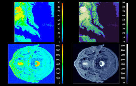
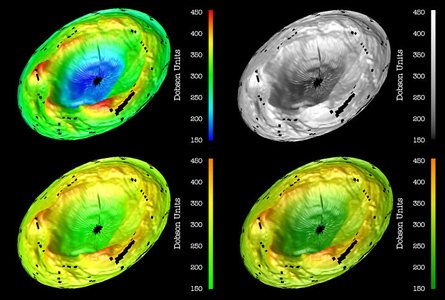
I came across a very interesting article by IBM researchers Bernice Rogowitz and Lloyd Treinish. It’s called “Why Should Engineers and Scientists Be Worried About Color?“, and it deals with how human perceptions of color can affect the representation of information. While graphic designers may or may not be familiar with this, it was certainly new to me.

The premise of the article is that traditional means of representing data, such as the rainbow colormap (left images), have significant drawbacks. In particular, the human eye is not very sensitive to variations in hue. (This is what we think of as color; the spectrum between red, yellow, green, blue, etc.) It is more sensitive to variations in luminance (the brightness of a color, from light to dark) and saturation (the amount of color, from none – grey – to full color).
Additionally, the authors find that saturation is better at representing information with low spatial frequency — that is, information that changes gradually. And luminance is better at representing information with high spatial frequency — information with lots of noise, texture, or rapid variation.
The authors proceed to demonstrate how to better represent information using perceptual colormaps. By selecting the right variations of luminance, saturation, and hue, you can create a colormap in which equal steps in the data are perceived as being equal, and in which both high and low spatial frequency data are clearly represented.

The full article is a a very interesting read.


